Landmark - Brand positioning
Building a brand reputation in to a landmark success.

In Brief
Client
Landmark
Projects
Brand naming, Brand evaluation, Brand identity, Website, Marketing Campaigns, Literature and Marketing Materials, Exhibition panels
Concept
Research was undertaken to understand the context and competition to the new name and Peek prepared a report with recommendations for the Landmark team to consider. The new name and branding was then developed.
Website
madebylandmark.com


About this project
We were approached by the team behind what was to become the new Landmark brand to help them convert over 25 years worth of experience into a brand that was relevant to the diverse audiences a signage business faces today.
Over the years, the company had built a reputation for high quality, effective solutions throughout the UK, but the brands they were operating under had become fractured and disconnected.
They approached Peek to address this problem and to deliver a new name that was both relevant, established and resonant to their audience.
Challenge
The name also needed to allow for the markets they covered to be addressed and highlighted when appropriate. The areas are as diverse as high-end architectural signs, heritage signs, educational and healthcare. However one thing tied them all together and that was the team's focus on their client and end-user experiences. Landmark are committed to continuous evaluation and improvement to ensure that the next project completed is the best ever. The essence of this commitment is conveyed in the pyramid of Ls that build one on top of the other.


Our solution
The new name was developed and assessed. Research was undertaken to understand the context and competition to the new name and Peek prepared a report with recommendations for the Landmark team for consideration.
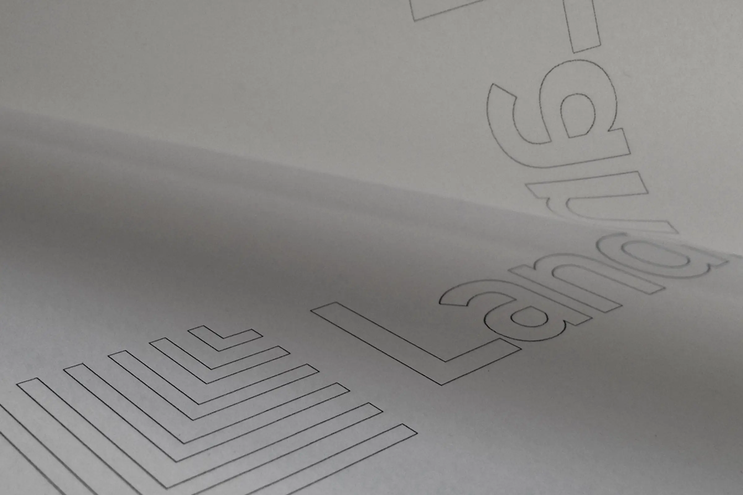
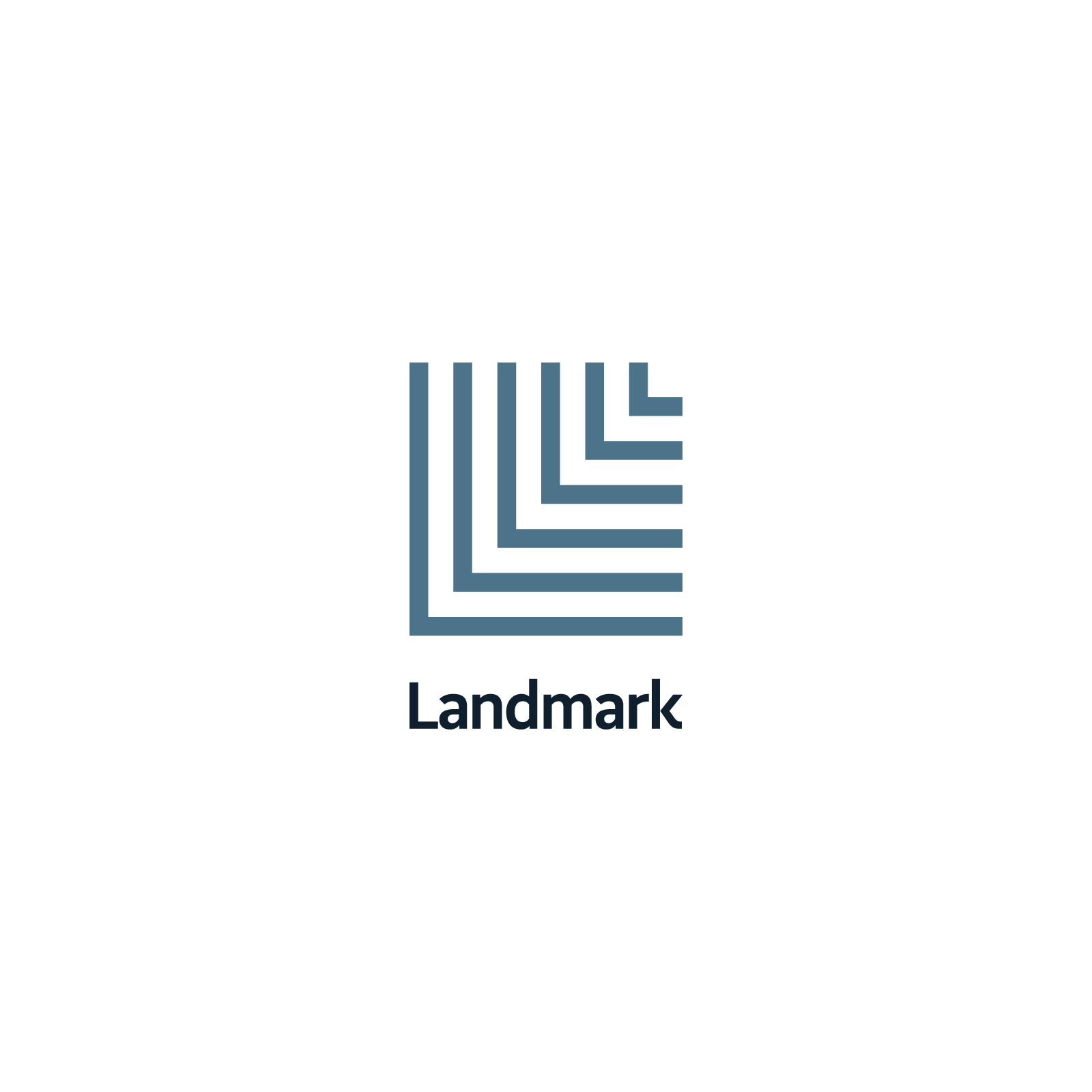
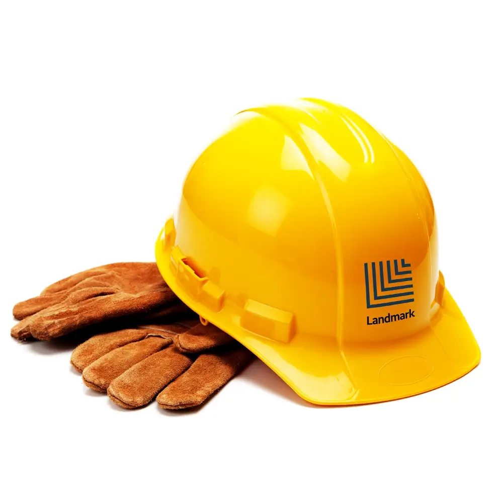
Peek designed a marque that represented the six layers of specialism that Landmark offer into a memorable and distinctive brand.
The Landmark logotype has been designed to work in two formats. The reversed out format is the primary brandmark for the website and online and positive brandmark is used on liveries and printed materials.
The Landmark L pyramid symbol is used as the Brand icon for social media icons, apps and favicons.
The six layers of specialism that Landmark offer is represented in a memorable and distinctive brand.
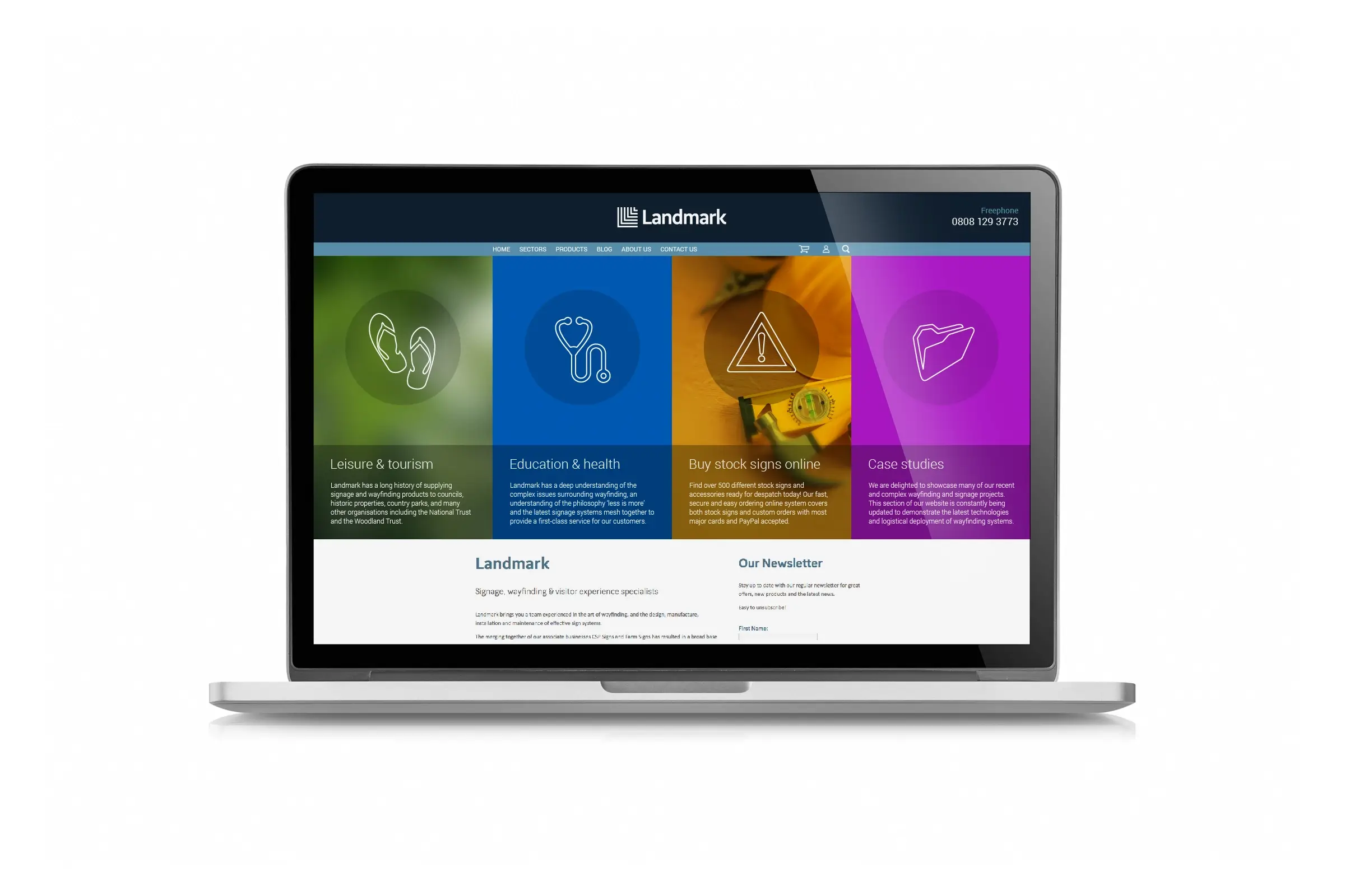
The website was designed and the brands look and feel established.
Key marketing material was developed to enable the business to approach and tender for new work.
“We would have no hesitation in recommending Peek to other businesses.”
Guy Walton, Landmark